

There are some things you expect to find at your local flea market. And some things you do not. This little beauty, belongs to the later category. This is a marketing brochure (circa 1930-40?) for Adolphe Mouron Cassandre's avant-garde typeface Bifur.
AM. Cassandre (1901 – 1968) was, and still is, a hugely influential poster artist. But he was also a graphic designer, type designer, painter, set-designer & teacher. He designed a handful of typefaces: Bifur (1929); Acier (1930); Acier Noir (1936); Peignot (1937); Touraine (with Charles Peignot, 1947); Cassandre (1968). Peignot is still widely available and in use today.
Bifur was commissioned by Charles Peignot, head of the French typefoundry, Deberny et Peignot. This brochure appears to be the UK release / promotion of the typeface by Soldans Ltd (44 Eagle St, London), a type foundry that no longer exists, and which I can find little about.

While Bifur is not the only pre-war experimental typeface of note (see Jan Tshichold, Herbert Bayer, Josef Albers etc), this is one that was actually made (un)commercially available for designers to use.
"There were no new or innovative typefaces which existed at the time. The Bifur created a real scandal...at least in the small world of publishing and printing. Engraving this design was a remarkable tour de force. Needless to say, Bifur was not a financial success, but in those happy days one could afford to take a few risks." - Charles Peignot.
Indeed, I'm not sure that I've ever seen an example of graphic design that uses it, even by Cassandre himself.
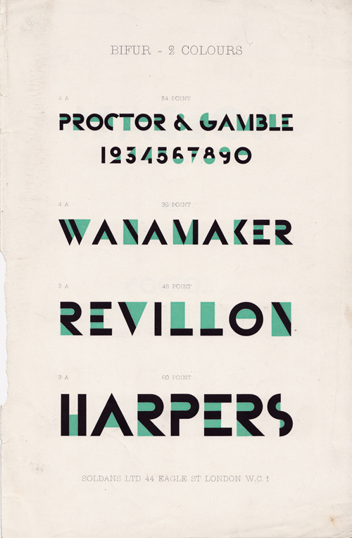
The brochure is a 17 x 26cm stapled booklet with 16 pages printed in three colours throughout. Some of pages are separated with either a thin yellow or a blue coloured acetate sheet. Only a small amount of the blue one still exists in my copy.
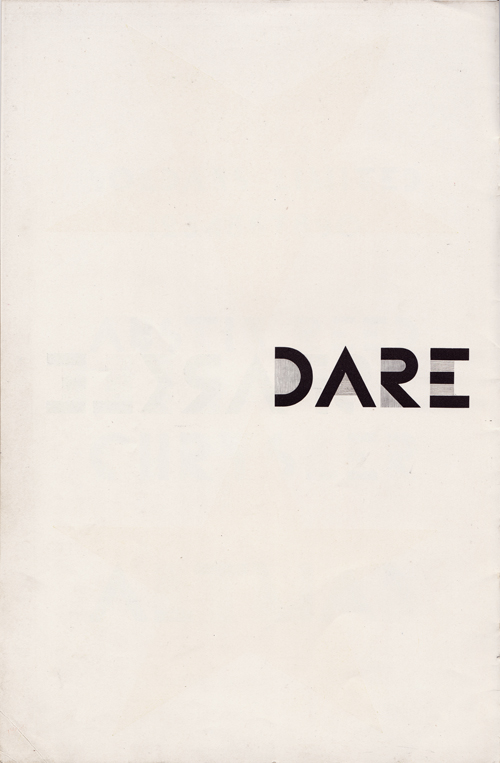
The pages, elegantly introduce, with a slow pace, and explain how Bifur could, should & should not be used (note the stunning page repeating 'This is not the way to use Bifur' ad infinitum!). I would guess that it was designed, or closely art directed by Cassandre himself.
Anyway, it's an amazing snapshot of graphic / typographic history.
Below, is the introduction, or rather intellectual argument, for such a beautifully folly. I've chosen not to clean up the photos, I think it's important to remember just how old this.

Here are all 16 pages in order...


Further information
For larger versions of these images click here.
Official website for the Estate of AM. Cassandre
AM. Cassandre on Wikipedia
Books about AM. Cassandre (on Amazon)
Bifur font - for your computer (free & paid for versions)
Text & photos © 2011 Gary Andrew Clarke
Bifur © Adolphe Mouron Cassandre
2 comments:
Awesome! Congratulations for this wonderful find.
One of the rarest type specimens of D&P to find, and one of the most beautiful too! Congratulations!
It’s dated 1929. The Bifur type specimen brochure was brought out in 3 versions, two french ones for 1928 and 1929, and an english one, aimed at the UK and US market (Chrysler!).
I myself own a French version of 1929. Its aluminium cover oozes futurism, the use of colored cellophane sheets in publishing was new in the nineteentwenties. Love it!
Soldans Ltd. was one of the most important importers of foreign typefaces in England. It imported french typefaces from Deberny & Peignot. In the 1910’ & 1920’s its elegant French historical typeface revivals were a welcome addition to the historical material of Monotype. It also imported the novelty German typefaces. (See ‘The British Printer” of that time)
The Bifur appeared in a time that the ‘German’ grotesks and egyptiennes like Futura and Memphis would become increasingly popular. Their fashionable character threatened the hold of D&P on the market for novelty typefaces. The D&P promotional department – in the person of Maximilien Vox – used the Bifur to emphasise France ‘brilliant’ contribution to typeface design: the highly contrasted type didot typefaces with their stripelike serifs and fat stems.
He wrote of the german grotesks–with no contrast–as cavemenlike constructions, thus contrasting French elegance against German simplicity. Despite Vox eloquence D&P was not able to introduce a typeface that could match the German succes of the Futura untill the nineteen sixties, the French ‘Univers’.
NB Your version was offered for sale some years ago at Modernism 101 books for around 250 dollars. A French version was offered for 2500 dollars a few months ago.
Post a Comment